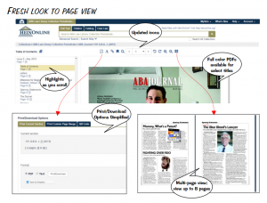
HeinOnline has just released a new, enhanced interface that is both modern and fresh. If you are like me you probably loved Hein’s content, but did not love the awkward and sometimes confusing site layout. After listening to feedback from its users, HeinOnline now boasts a simplified, clean and update look that is far more intuitive than the previous version. In addition to the improved layout, the new site is mobile friendly, has a stationary search bar and new home button, all making navigation much more user-friendly. Take a minute to jump on and explore the new-and-improved HeinOnline.


